CSS Flexbox Layout Module (Part-2)

By Aliul Islam
Date: February 20, 2020

Hope that you all like my last blog about Flexbox. Today we will learn more about Flexbox elaborately.
1. Flexbox Direction
Flexbox direction is a single direction concept. Flex has two direction horizontal rows or vertical columns. Flexbox direction property:
.container {
   flex-direction: row | row-reverse | column | column-reverse;
}
The flex-direction default value is row. Now we will create a menu-bar where we are going to use flex-direction.
HTML :
<div class="container">
       <h2 class="header">flex-direction property</h2>

       <ul class="menu">
           <li><a href="#home">Home</a></li>
           <li><a href="#news">News</a></li>
           <li><a href="#contact">Contact</a></li>
           <li><a href="#about">About</a></li>
       </ul>
</div>
CSS:
body {
   margin: 0;
   padding: 0;
}
a{
   text-decoration: none;

}

li{
   list-style: none;
}
.container {
   width: 800px;
   background: #CECECE;
   margin: auto;
}
.header{
   margin-bottom: 5px;
}

.menu {
   display: flex;
   justify-content: center;
   flex-direction: row;
}

.menu>li {
   padding: 5px;
}
Output:

Suppose we want the menu in reverse order, change flex-direction value to row-reverse.
Output:

Another most exciting use of flex-direction is a sidebar menu. We can easily create vertical column-wise sidebar menus. Here we change the flex-direction to the column.
CSS:
.menu {
   display: flex;
   justify-content: center;
   flex-direction: column;
}
Output :

You can also reverse the column output.
.menu {
   display: flex;
   justify-content: center;
   flex-direction: column-reverse;
}
Output:

2. Flexbox Item order
By default, flex items an order is source order. Suppose we have three items. Now we change the view order without changing the HTML.
Now we want item-2 to be the first position and then after item-1 is second and item-3 is third. We change it by merely copying paste item-2 before item-1, but now we don’t touch HTML code. We use flex order property. Now we see how to change their position.
HTML:
<div class="content">
           <div class="item">
               <h3>Item 1</h3>
               <p>
                   Lorem Ipsum is simply dummy text of the printing and typesetting industry. Lorem Ipsum has been the industry's standard dummy text
                   ever since the 1500s, when an unknown printer took a galley of type and scrambled it to make a type specimen book. It has survived
                   not only five centuries, but also the leap into electronic typesetting, remaining essentially unchanged.
               </p>
           </div>
           <div class="item">
               <h3>Item 2</h3>
               <p>
                   Lorem Ipsum is simply dummy text of the printing and typesetting industry. Lorem Ipsum has been the industry's standard dummy
                   text ever since the 1500s, when an unknown printer took a galley of type and scrambled it to make a type specimen book.
                   It has survived not only five centuries, but also the leap into electronic typesetting, remaining essentially unchanged.
                   It was popularised in the 1960s with the release of Letraset sheets containing Lorem Ipsum passages,
                   and more recently with desktop publishing software like Aldus PageMaker including versions of Lorem Ipsum.
               </p>
           </div>
           <div class="item">
               <h3>Item 3</h3>
               <p>
                   Lorem Ipsum is simply dummy text of the printing and typesetting industry. Lorem Ipsum has been the industry's standard dummy text
                   ever since the 1500s, when an unknown printer took a galley of type and scrambled it to make a type specimen book. It has survived
                   not only five centuries, but also the leap into electronic typesetting, remaining essentially unchanged.
               </p>
           </div>
       </div>
CSS:
.content{
   width: auto;
   display: flex;
   justify-content: center;
   margin-top: 10px;
}

.content>.item {
   text-align: center;
   border: 1px solid #000000;
   margin-right: 5px;
   padding: 5px;
}
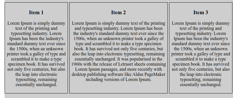
Before use order property its look like this :

Now change there order :

CSS:
.content :nth-child(1) { order: 2; }
.content :nth-child(2) { order: 1; }
.content :nth-child(3) { order: 3; }
We don’t need to change HTML code where easily can change their order by using their flex order property.
3. Flexbox Grow property
This defines the ability for a flex item to grow if necessary. It accepts a unitless value that serves as a proportion. It dictates what amount of the available space inside the flex container the item should take up.
If all items have flex-grow set to 1, the remaining space in the container will be distributed equally to all children. If one of the children has a value of 2, the remaining space will take up twice as much space as the others (or it will try to, at least).
HTML:
<h1>The flex-grow Property</h1>

       <div class="grow">
       <div style="background-color:#FB7F4F;"></div>
       <div style="background-color:#ADD8E6;"></div>
       <div style="background-color:#F0E68C;"></div>
       <div style="background-color:#FAC0CA;"></div>
       <div style="background-color:#9F5E31;"></div>
       </div>
CSS:
.grow {
   width: 100%;
   height: 100px;
   border: 1px solid #c3c3c3;
   display: flex;
}
  .grow div:nth-of-type(1) {flex-grow: 1;}
 .grow div:nth-of-type(2) {flex-grow: 3;}
 .grow div:nth-of-type(3) {flex-grow: 1;}
 .grow div:nth-of-type(4) {flex-grow: 1;}
 .grow div:nth-of-type(5) {flex-grow: 1;}
Output :

So today we learn about direction, order and the grow property of Flexbox.


