The ongoing Coronavirus pandemic is impacting every part of our lives. Besides, it has wide-ranging ramifications for marketing, advertising and eCommerce as well as several other sectors like travel, entertainment and FMCG. As opposed to, the pandemic has defined a new category of goods called “new essentials.” New essentials are products that help consumers feel
Hope that you all like my last blog about Flexbox. Today we will learn more about Flexbox elaborately.
1. Flexbox Direction
Flexbox direction is a single direction concept. Flex has two direction horizontal rows or vertical columns. Flexbox direction property:
Suppose we want the menu in reverse order, change flex-direction value to row-reverse.
Output:
Another most exciting use of flex-direction is a sidebar menu. We can easily create vertical column-wise sidebar menus. Here we change the flex-direction to the column.
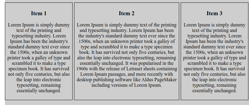
By default, flex items an order is source order. Suppose we have three items. Now we change the view order without changing the HTML.
Now we want item-2 to be the first position and then after item-1 is second and item-3 is third. We change it by merely copying paste item-2 before item-1, but now we don’t touch HTML code. We use flex order property. Now we see how to change their position.
HTML:
<div class="content">
           <div class="item">
               <h3>Item 1</h3>
               <p>
                   Lorem Ipsum is simply dummy text of the printing and typesetting industry. Lorem Ipsum has been the industry's standard dummy text
                   ever since the 1500s, when an unknown printer took a galley of type and scrambled it to make a type specimen book. It has survived
                   not only five centuries, but also the leap into electronic typesetting, remaining essentially unchanged.
               </p>
           </div>
           <div class="item">
               <h3>Item 2</h3>
               <p>
                   Lorem Ipsum is simply dummy text of the printing and typesetting industry. Lorem Ipsum has been the industry's standard dummy
                   text ever since the 1500s, when an unknown printer took a galley of type and scrambled it to make a type specimen book.
                   It has survived not only five centuries, but also the leap into electronic typesetting, remaining essentially unchanged.
                   It was popularised in the 1960s with the release of Letraset sheets containing Lorem Ipsum passages,
                   and more recently with desktop publishing software like Aldus PageMaker including versions of Lorem Ipsum.
               </p>
           </div>
           <div class="item">
               <h3>Item 3</h3>
               <p>
                   Lorem Ipsum is simply dummy text of the printing and typesetting industry. Lorem Ipsum has been the industry's standard dummy text
                   ever since the 1500s, when an unknown printer took a galley of type and scrambled it to make a type specimen book. It has survived
                   not only five centuries, but also the leap into electronic typesetting, remaining essentially unchanged.
               </p>
           </div>
       </div>
We don’t need to change HTML code where easily can change their order by using their flex order property.
3. Flexbox Grow property
This defines the ability for a flex item to grow if necessary. It accepts a unitless value that serves as a proportion. It dictates what amount of the available space inside the flex container the item should take up.
If all items have flex-grow set to 1, the remaining space in the container will be distributed equally to all children. If one of the children has a value of 2, the remaining space will take up twice as much space as the others (or it will try to, at least).
So today we learn about direction, order and the grow property of Flexbox.
The FlexBox Layout Module makes it easier to design a flexible, responsive layout structure without using float or positioning. Before the flexbox layout module, there are four layout modules:
1. Block 2. Inline 3. Table 4. Positioned
To work with flexbox, we don’t need to install any extra plugins or software. It is a built-in property of CSS3. It is a layout to work. It’s straightforward to use in your project.
Browser Compatibility
Flexible Layout must have a parent element with the display property set to flex. Today we will learn how to place a logo center in the header section. First we create index.html file
Here you can see that we write no media query CSS to make it responsive. It’s already responsive. Now overview the CSS.
We put display flex on the parent class. Parent class also has two CSS property align-item and justify-content. Align-item is working on y-axis and justify-content working on the x-axis. If we want a content position in a horizontal center, we use justify-content: center, that places the content to center position. If we want a content position in a horizontal center, we use align-item: center, that places the content to center position.
/* Item Position alignment */
align-items: center; /* Make items around the center */
align-items: start; /* Make items from the start */
align-items: end; /* Make items from the end */
align-items: flex-start;/* Make the flex items from the start */
align-items: flex-end; /* Make the flex items from the end */
justify-content: center; /* Make items around the center */
justify-content: start; /* Make items from the start */
justify-content: end; /* Make items from the end */
justify-content: flex-start;/* Make the flex items from the start */
justify-content: flex-end; /* Make the flex items from the end */
In my next blog, we will talk more about Flex-box, with some other tricks…
Subscribe to our newsletter
Want to receive a fortnightly round up of the latest tech updates? Subscribe to our free newsletter. No spam, just insightful content covering design, development, AI and much more.